Chapter 6 Interactive component
6.1 Link to the interactive plot
Click link here or copy the url: https://observablehq.com/d/637d7936589cafb0
6.2 Descriptions
The interactive part of our project was built with D3 on Observable, which is the official web tool for creating and sharing D3 code. We randomly select 1/100 of the original data-set which was collected from 10/28/2021 to 11/04/2021 within several specific time-slots. Based on the LLN, the newly organized data-set with features user_id, created_at, follower_count, sentiment_score, original_text, sentiment can still reflect the true distribution of the sentiment. You can find the data here under the data folder of our repo.
6.3 Instruction for using the map
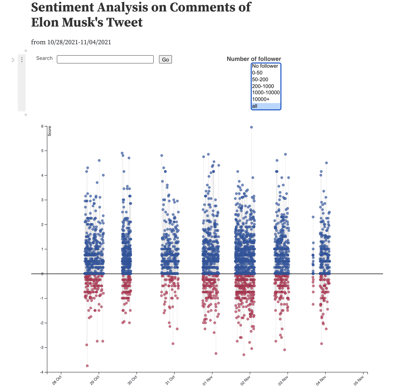
The plot is initialized with the sentiment score we get after NLP process with no default follower group and comment search specified. The y-axis gives the sentiment score of each comment with color blue reflecting positive and red reflecting negative attitudes.
User can hover the mouse over a circle to see user id, tweet contents, and sentiment score in detail.
User can search for exact words in the tweet content posted by Twitter users. For example, entering
Teslain the search bar and click go will give several data circles in the plot with more positive than negative.User can filter the comments based on the number of followers of the user. This function can be used together with the
searchfunction introduced above to present a customized distribution of comments.
Notes:
The x-axis indicates the date value which is not continuous because our datasets are not crawled and collected 24 hours each day.
The score and sentiment results are completely based on the previous NLP process so there are still possibility of misclassification.
Considering the density of the circles in the plot, move your mouse slowly to the low right part of the exact circle and wait for the tooltip.
To reset the plot, please left the search bar empty and choose
allfor the filter, then clickGo, and you will get a default plot like this:

Reference:
- Obeservable: Search Sentiment Analysis of Billboard Top 100 Songs 2000-2018. https://observablehq.com/@vizbiz/search-sentiment-analysis-of-billboard-top-100-songs-2000-2